
Though many like the “sketchy” style of artwork, be it a pencil drawing, charcoal work, or watercolor, one simple step you can take to pull ahead of the artist pack is to clean up your art work.
Messy lines (extra sketch lines, ink that doesn’t follow the color in a painting, splotches and smudges) can detract from an otherwise beautiful piece. Luckily, a little care is all that’s required to turn an artwork from good to great.
It’s good to know your erasers so you can clean things up appropriately. Most artists know about the venerable kneaded eraser, which is great for cleaning up rough textured paper. If you are working on smooth paper, though, certain old fashioned drafting tools may work better. You can use a white vinyl eraser, the kind with the cardboard sleeve (like the one you see above), for many applications. It’s nice because it’s also gentle on paper but does a very good job cleaning up pencil marks. As a bonus, the cardboard sleeve gives you a good grip and keeps your gingers clean!
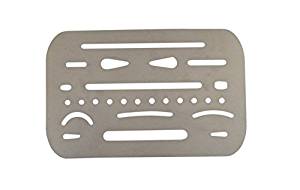
Another secret weapon for cleaning up your sketches is an eraser shield. They are small, cheap, made of metal, and perfect for taking a bit of a line while protecting the rest of the work. They look like this:
 As you can see, you can use this to cover your art and then just erase a bit at a time. Many artists and people who haven’t taken an old fashioned drafting class have never heard of them, especially in this day of Computer Aided Drafting. I love mine.
Last but not least, a really good sketching tool is just a good, old fashioned mechanical pencil. I really enjoy using one because I never have to sharpen it, I can use a variety of leads, and if I use a light touch with it, the lines are extremely easy to clean up. It’s perfect for a sketch that I plan to ink later. Then when I am done, I can make a nice, clean image. I can go from this sketch to this drawing with very little trouble.


As a last tip for people wanting to avoid messy looking artwork, I do suggest getting to know your graphics programs. When you scan something in to the computer or photograph it, turning up the contrast even just a bit can help your black and white drawings look that much sharper and clearer. It takes a bit of practice but is well worth the effort.
As a confession, I used to make the hairiest, sketchiest drawings ever and consider them finished work. I don’t do that anymore. I still sketch things out on occasion but I use those sketches as ways to develop ideas instead of thinking they are done. Now, my erasers and mechanical pencil are my best friends.
Happy creating!


You must be logged in to post a comment.