

If you talk to some painters, they will tell you that black is an unnatural color and it shouldn’t be used. I’m not one of them, I use black even in paintings with color. Personally, I think black is essential, and a dash of it will really help everything else be more visible. Black is really great if you want some drama, as in the photo above that I took yesterday.
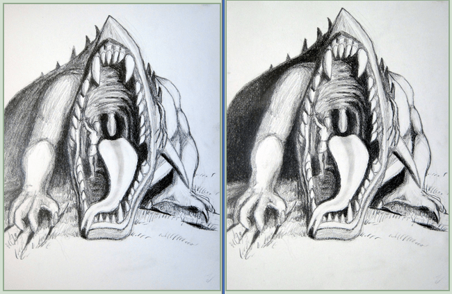
Here is another example. Between the two drawings, I think it looks much better once the darks are truly darkened. That will happen with steady, even pressure, and a pencil that’s on the soft side.
You can also see this principle with pen and ink. Drawings with fields of black just pop out a little better and draw the eye. I was trying for this effect when I did this lioness. I think you will see she stands out a lot better than her stretching sister.


Black also looks better in drawings when you use smooth fields of it, and let it truly be dark. Here, by the way, is an example of a painting where I used black in a color setting. It’s a book cover that had some pretty specific requirements.


You must be logged in to post a comment.