I wanted to take a picture of the moon last night the same as I did two nights ago, but it wasn’t in the right position to use my usual trick of bracing my camera on the back fence. Still, the sheer beauty of the moon as it peeked through the treetops made me find a way, and it worked well enough that I wanted to share it here.
I sat in a chair so that part of me was braced, and for a monopod I used a sponge mop! It was dry, so no harm done to the camera. However it worked well enough that I was able to get several shots of the moon. At maximum zoom, it’s of course rather hard to hold still, and this little help was invaluable. The spongy texture was stiff enough to support my hands and the camera, and soft enough not to scratch the finish, and the pole handle made a sturdy base that I could angle as I liked.
The featured image shows my result. Still not perfect, but my camera isn’t a fancy expensive one and I was doing without a tripod or telescope. I’m happy with it!
Japanese ink painting is an ancient, yet truly enjoyable art form that creates a striking, often monochromatic style. Some consider it a Chinese art, however these paintings are very highly esteemed in both countries.
It trains you to paint bravely, being careful and fluid at the same time. It shows you how to go with the flow and not look back.
Sumi ink stone
Some people use colors in their sumi paintings, even gold paint, but I currently don’t. At it’s essential core, this kind of painting is about deep black ink, a natural-bristle bamboo handled brush, and some nice paper.
One of the really cool things about sumi painting is that although you can buy liquid ink in a bottle, you can also grind your own. Ink sticks are generally made with pine soot and natural glue. You rub them against the ink stone, with a little water, to make your ink. There’s something very grounding about watching the ink form in your stone.
Sumi Brushes
Ink stones aren’t too expensive, neither are brushes, and you only need one or two to start. Paper can be pricy but there are cheap options, so this is an easy thing to try. If you decide to stick with it, you can get better materials.
When you are getting started with sumi, it helps to try making different strokes – the direction your brush moves in, combined with the pressure you use, determines what your mark will be. Sometimes you need to plan ahead with your marks, because you have no way of erasing, but if you hesitate you will put down too much paint. It’s good to practice by trying to copy a simple painting, to see how to make the lines and marks.
Sumi ink can also be thinned out to make washes, like watercolor. If you use the proper kind of paper, Japanese Washi, it will preserve all the fine details you have made and the ink won’t spread too much, nor sit on the surface.
There are, of course, online tutorials, videos, and books to teach you this art, or you can play around and see what you can make on your own. Sumi can even be a form of moving meditation. A common exercise is to breathe deeply and see how perfect a circle you can draw with a single stroke.
I’ve barely scratched the surface here but I hope you can see what endless vistas can be explored. If you’d like to try too, click on the images to see where to get the supplies.
(featured picture by Pixabay, art materials from DickBlick.com)
Whether we’re talking about a story, an article, a painting, or a drawing, the devil really is in the details. Get them wrong and you have a flop. Get them right and you’ve made something great.
Research is really important to make sure you get those details right. Just how should the knight’s sword gleam? What does a rose smell like, exactly? How does a Great Dane generally behave? What are some of the normal brands of potato chip bought in the East Coast?
Details, and how you portray them, are everything. If you’re writing about an object, the reader should know what it looks like. They need to know the color, make an model of the car the protagonist sees. The scent of the forest as the heroin walks into it. How the fur of the wolf feels as the hero tentatively strokes its ruff.
In a picture, little details can really make it come alive. Say you paint a mountain scene. It’s pretty, but what’s going on? Add a bird, and there’s life. Add a boat and a mysterious head in the high mountain caldera-lake, and you have a story. What creatures populate your woods? Who walks through your cities? What do they wear? How do they live? In a portrait, what favorite piece of jewelry, what sly look of the eye, will the viewer see?
Remember to include these things and watch your viewers, or readers, love you.
I think the waning harvest moon is almost prettier than the full face. I took this with a Nikon Coolpix L830, and it’s not too bad for all of that. It was at maximum zoom, and my hands were braced on the top of my car. All thanks to my neighbor, who alerted me to the sight.
There, I said it, I admit it! I don’t buy my art supplies locally. I used to, though. I tried to buy locally, I loved the idea of supporting local businesses. I even thought about offering art classes, something I might still do someday.
Even though I love browsing through wonderfully musty smelling shelves full of materials that make my fingers fairly itch with the desire to try new things, I gave that up.
Why? Unfortunately, people’s attitudes were what caused the estrangement. I’d noticed some real snootiness when I’d gone to the better art stores, and the craft stores have gotten increasingly uncomfortable and gimmicky to be in. One major chain’s loss prevention tactics, where they make you walk through a maze to leave, are particularly annoying.
I also noticed how I was treated well, listened to, and mentored in art stores, while my dear partner was routinely snubbed and ignored. She didn’t look as “liberal” as I did. Also, a particular store manager at lied to me on a number of occasions.
“We had to get rid of that line of paint because Amazon is undercutting us.” Really? Then why does Amazon charge two dollars more?
“This brand of paint is better anyway.” Really? Then why does the coverage suck?
The “Chinese art teacher” who didn’t even know how to grind his own ink didn’t help.
Later, that store manager kicked me out of the store and never said why. I was baffled and hurt, and wondered where I would go for art supplies.
Ultimately I moved online. I started using Dick Blick Art Supplies, also known as Utrecht at some of their locations. They carry a huge variety of supplies, have great prices, support local artists, give people a chance to be seen in their art catalogs, have a great review community, and also have amazing customer service.
Considering that I’m still giving my money to a really good, domestic art store that is passionate about supporting artists, I’m proud to share my dollars with them. As a bonus, they give a referral commission to people who share their affiliate links. Like this one. Beat that, snooty Tucson art store!
I’m really happy Dick Blick is around. My search for quality art materials, responsibly bought, is over.
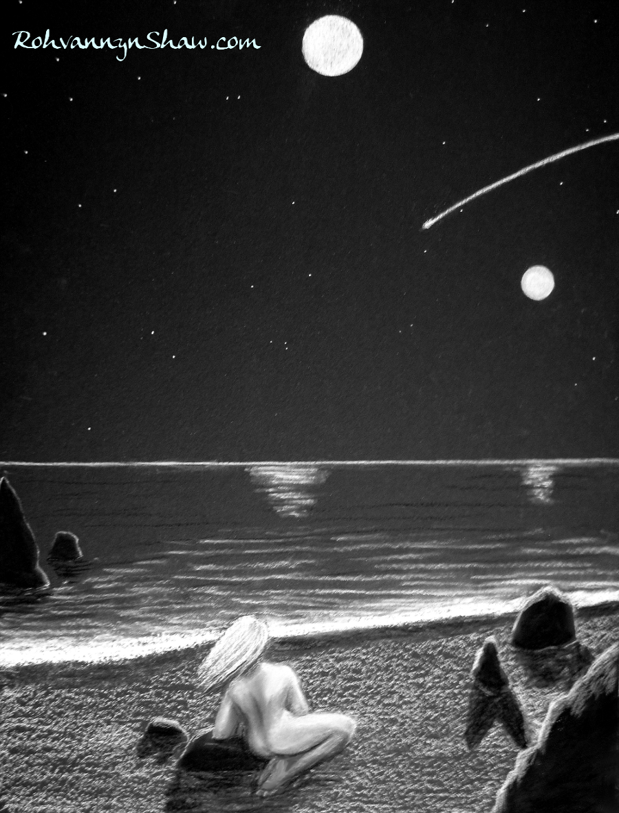
A few years ago, I realized that it was tremendously fun to work with chalk, Conte, colored pencils or white paint pens on a perfectly black background. I loved the dramatic look and enjoyed the fun of working entirely with highlights. However, I quickly grew tired of dealing with inadequately pigmented construction paper, and black gesso was expensive and messy. Black paint was inadequate. Black foamcore mattboard was nice but expensive and flimsy.
I craved something better!
After much searching I found a perfect solution online. That was ultra-black presentation board! Made for mounting photographs and other art, this stuff is ideal for painting or drawing on. It takes paint well and doesn’t fall apart, it’s reasonably stiff, it has enough texture to make using chalks and pencils a breeze. It’s light, and best of all, it doesn’t cost an arm and a leg! A five pack of the largest size is only around $20 and it comes in several sizes. Here’s one piece I created with this material.
I was ecstatic. I love creating with this material! It is easy to work with and looks great, and at the same time these boards are cheap enough, that I want to actually use it instead of “saving for the right piece” which may never come. Black presentation board is easy to frame, too, and easy to fit on an easel. Best of all, when I need more, I just go online and my favorite art store delivers more within a week, safely packed for me.
If anyone wants to try this amazing material, I found the best price at DickBlick.com. Funny name, amazing company. If you check them out, use this affiliate link and you won’t be sorry. They offer amazing deals and great customer service too. They also carry all my favorite supplies at prices below their competition.
to find the best perfectly black background I’ve ever seen. While you’re there, you’ll see that they also carry Conte pencils, chalk pencils, Liquitex fine point paint pens, and about a half a million other things. Buy enough and they throw in free shipping.
This is the second version of a cover painting I did for a novel I wrote. I usually try to paint things that tell some kind of a story, but this was meant to be representational of some of the book content and hopefully somewhat intriguing to the casual viewer.
The novel was “The Dice of Fate,” a story about a young woman who was suddenly transported directly from her day job to a place that was like something from one of her roleplaying campaigns. Early in the story, a little white Kitsune with three tails comes and helps her, and the theme of dice features prominently in the story. Therefore, I chose to depict the kitsune, the ten sided die, and a hint of the long road she had to walk on foot to get to civilization.
I started (as usual) with the sky gradient. The better the sky gradient, the better the foundation of the work. Since this was acrylic, I could dispense any worry about the transparency of my layers. With the trees I worked from dark to light, always keeping in mind that most trees have gray bark, not brown. For highlighting, I used chalks and pencils in the final steps.
I was fairly pleased with the work. If anyone wants to see it on the cover, feel free to click through to the link – and if anyone wants to buy it, it’s free for Kindle subscribers. Just search the title “The Dice of Fate.”
I had this all done, then we noticed there was something that needed to be improved on the back cover. We got partially through improving it, then the graphics computer’s CPU died. Now the new CPU has been bought and installed and the back cover has been fixed. So everything is good to go!
This coloring book is all about dragons, 30 original illustrations, all full page. It’s great for anyone who likes to color. I donated the last copies of the ones with the improvement-needed back cover to flood relief in Texas, in hopes that some kids might at least have fun with them.
For art to impress, it’s helpful if it readily catches the viewer’s eye.
If you have your work scanned in on the computer, looking at the file thumbnails is an excellent way of quickly seeing what an art viewer sees as they pass by.
A similar effect can be had by putting the painting or drawing across the room from you and glancing at it quickly. This is how you can truly tell if your work has good contrast and interesting composition.
What pops out at you? What is the first thing that you see? Is that the main focal point of your work, or can you think of ways to make the art more impactful?


You must be logged in to post a comment.